mpl colormaps
Update: These colormaps have been merged into the development version of Matplotlib, all of them will be included in matplotlib 1.5, and "option D" (now called "viridis") will be the new default colormap in matplotlib 2.0. If you just want the colormaps themselves, they're available in a single file here under a CC0 "no rights reserved" license. Third parties have also made viridis available in R and Matlab and JavaScript / D3. Below is the talk presented at SciPy2015 that outlines the whole story.
The rest of this page is preserved for historical reference. If you have comments, concerns, or questions about the new colormaps, please get in touch via the matplotlib mailing list.
This page gives an overview of the colormaps we (= Stéfan van der Walt
and Nathaniel Smith) have designed as potential replacements for
matplotlib's default, jet.
First for comparison we show what several well-known colormaps look
like using a visualization tool we developed for assessing colormap
quality, and then give 3 4 new colormaps that we've designed. We'd like
feedback on which one you like best!
Please leave comments on
this thread
or email us directly (update: see
above).
Well-known colormaps
Jet
To start with, here's jet:
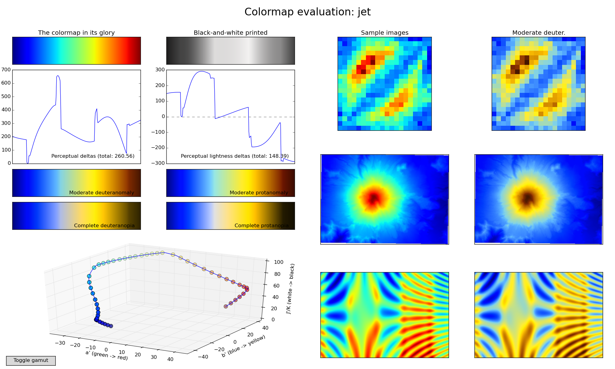
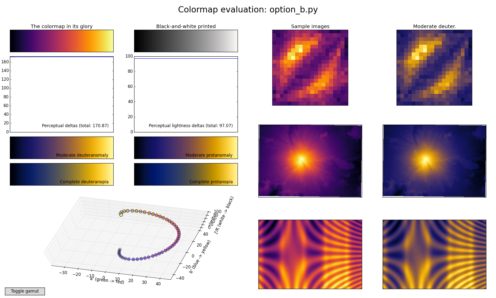
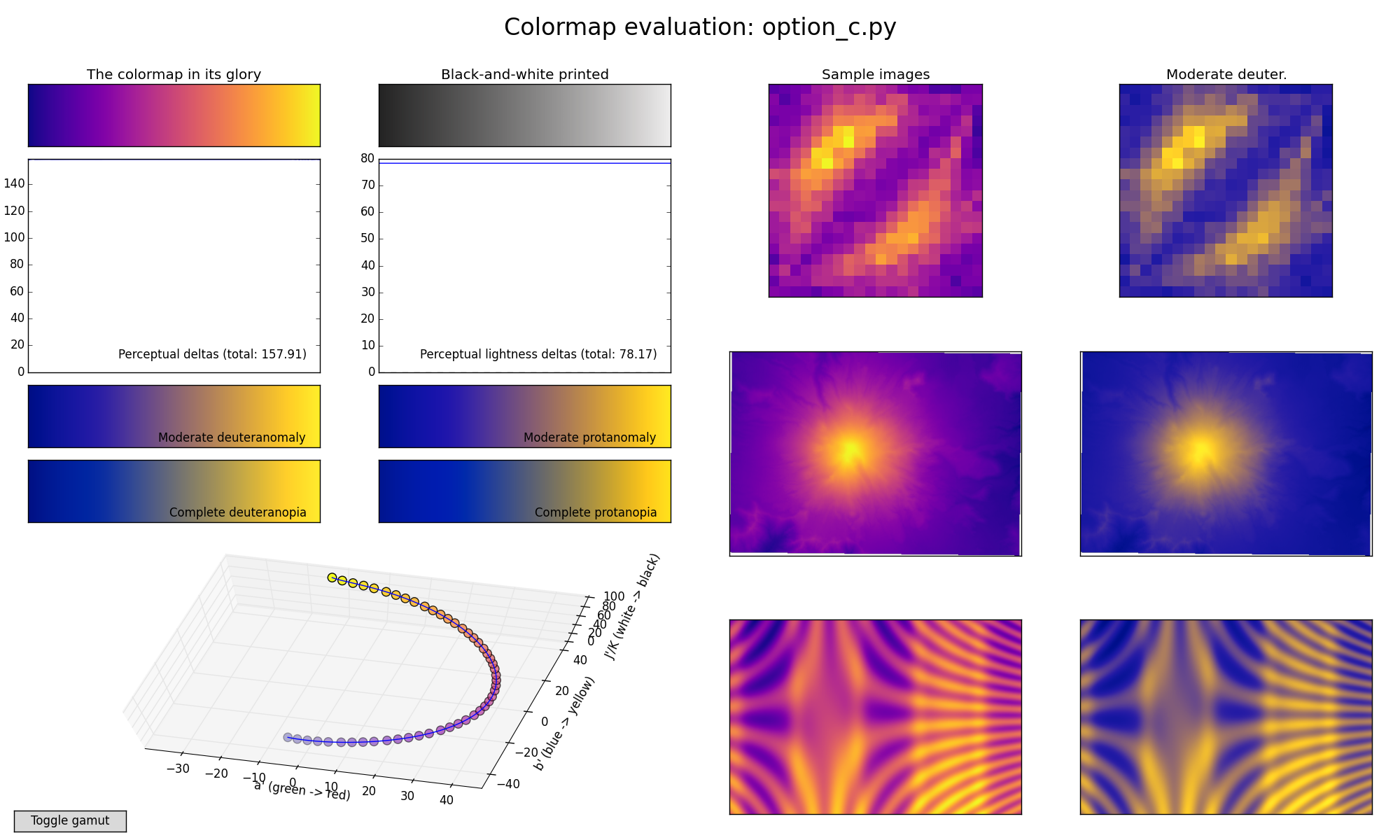
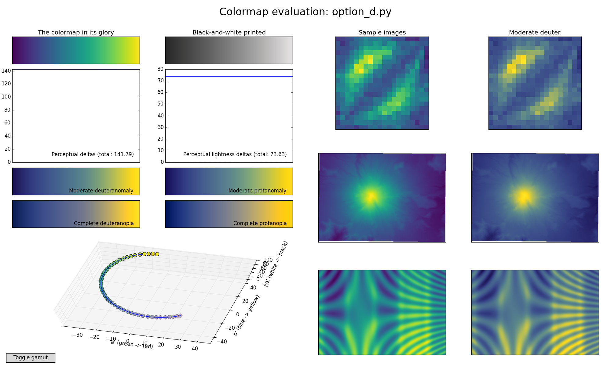
You can click on the figure to expand it. The annotated parts are:
A) From top left to bottom right: the colormap, its grayscale version, perceptual deltas and perceptual lightness deltas. Thereafter follows four different simulations of color blindness.
A "perceptually uniform" colormap is one for which the "perceptual deltas" plot makes a simple horizontal line. (This is essentially the derivative of the colormap in perceptual space with respect to the data. We want our colormap to have the property that if your data goes from 0.1 to 0.2, this should create about the same perceptual change as if your data goes from 0.8 to 0.9. For color geeks: we're using CAM02-UCS as our model of perceptual distance.)
You can see that jet is not perceptually uniform.
The plot on the right is similar, but shows how perceptually uniform the colormap is if you print it in black-and-white. We again want this to be a flat horizontal line.
Of the 4 colorblind simulations below, the upper-left one -- "Moderate deuteranomaly" -- represents by far the most common form. It affects something like 5% of white men. (Well, this is a slight simplification because some people will have somewhat stronger or weaker colorblindness, and this just picks a single point in the middle of the scale. But that's good enough for present purposes.)
B) A 3-dimensional visualization of the colormap spline through CAM02-UCS color space. This is more interesting in the interactive version. The little dots are equally spaced in the data space, so "perceptually uniform" in this plot means that the dots should be equally spaced in the visualization. In the interactive version (see below) you can click on the "Toggle gamut" button to see an outline of which colors are actually possible in sRGB.
C) Example images colored with the test colormap (left column) and how it would be perceived by readers with the most common form of color blindness (right column).
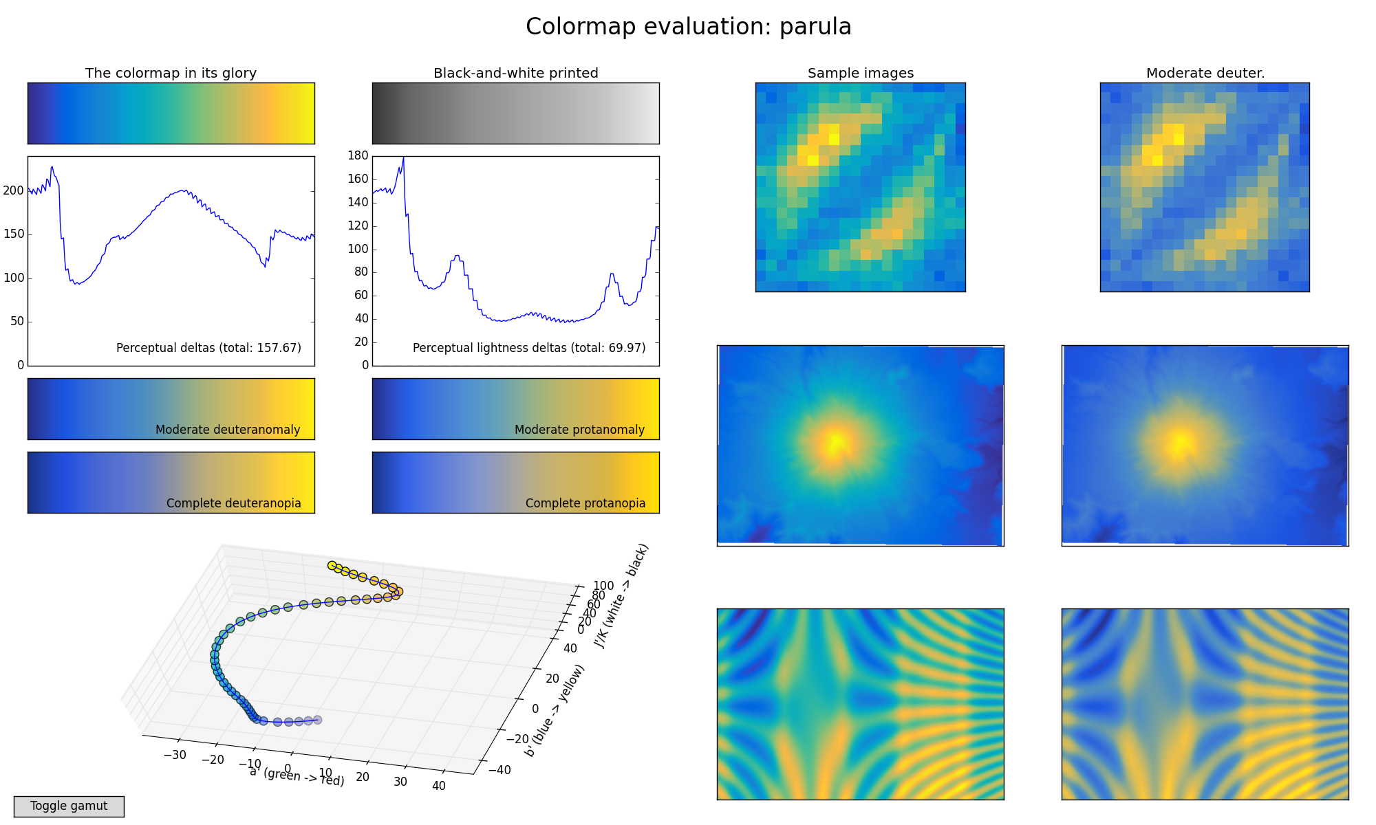
Parula
This is MATLAB(R)'s new default colormap.
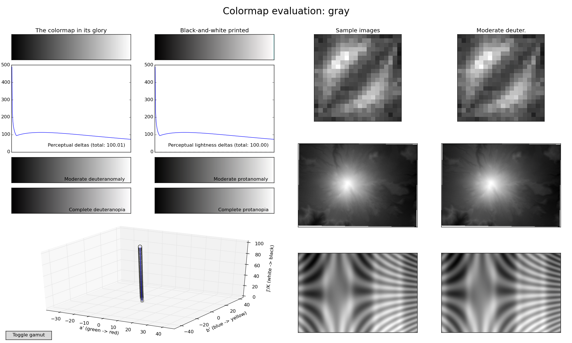
Gray
Good old "gray":
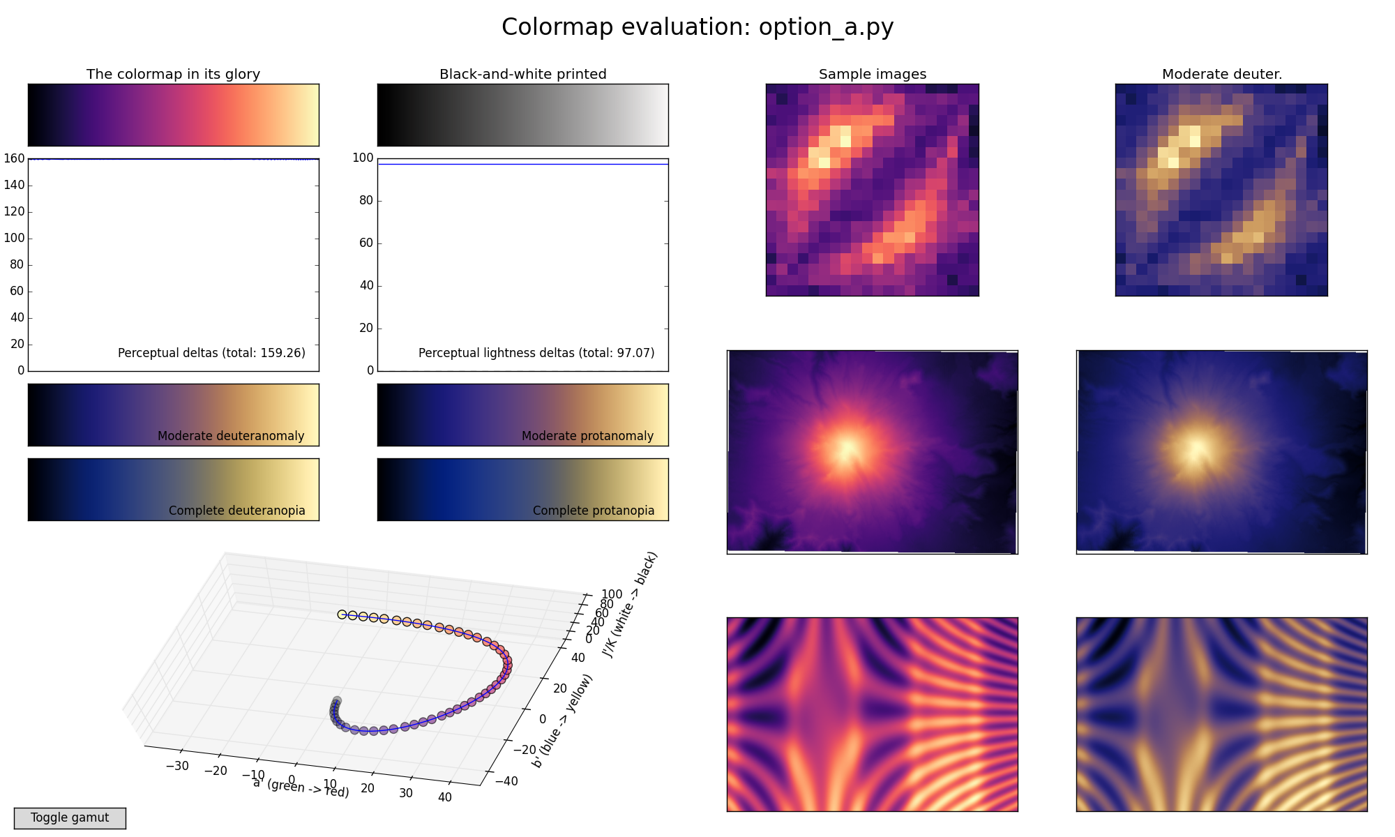
Our new colormaps
We've made a few new colormaps, all using the same general bluish to reddish to yellowish sequence, because this is relatively friendly to common forms of colorblindness.
Each of these is designed in such a way that it will analytically be perfectly perceptually-uniform, both in regular form and also when converted to black-and-white. So we don't have to worry about that.
The main question at this point then is just aesthetics: which of these do we want to "represent matplotlib's brand"?
Option A (Magma)
Option B (Inferno)
Option C (Plasma)
Option D (Viridis)
UPDATE: Here's a newly added greenish alternative option, based on a design by Eric Firing but with more yellow added at the top:
A sample video using the above colormaps
A simulation of galaxy formation, courtesy Nathan Goldbaum. You can watch the individual videos below, but I found it hard to compare apples-to-apples this way, so I also made a mosaic of all of them side-by-side, which you can download here. (I also uploaded to Youtube, but it ended up with terribly artifacty downscaling. You can see here if you really want, but I recommend downloading the full-resolution file instead.)
Jet:
Parula:
Option A:
Option B:
Option C:
Option D:
Appendix: How to generate these results or play around with these further
pip install viscm- Check out the
colormap scripts. Each file
provides a variable named
test_cmwhich is a matplotlib colormap object.
To visualize matplotlib built-in colormaps:
python -m viscm view jet
To visualize one of our colormaps:
python -m viscm view path/to/colormap_script.py
To make a nice screenshot like the ones above:
python -m viscm view CMAP --save MYFILE.png --quit
If you want to access the editor interface we used to make these colormaps and play around with designing your own variants:
python -m viscm edit path/to/colormap_script.py
[UPDATE: note that due to the bug described here,
then if you want to edit the colormaps in this repo in the original
form, you'll need to pass --uniform-space buggy-CAM02-UCS to the
viscm edit call above. The bug had negligible effect on the key
properties of the colorspace, but it did cause the space to be
rescaled overall, so that the coordinate paths that were chosen using
the buggy space do not make sense in the new space. If you're
designing a new colormap, you should make sure you have the latest
version of viscm and colorspacious, and then ignore all this and
just run python -m viscm edit.]
It looks like this. We leave it as an exercise for the reader to play around and figure out how it works--we may write up detailed docs later, but for now just some simple usage instructions:
Drag to move spline control points, shift-click to add a control point, control-click to delete a control point. The bottom bars let you set the min/max lightness, and click the colormap on the side to select which hue/saturation slice of color space you want the left pane to show. (The game is to keep the yellow dot inside the slice.) If it starts acting weird try tapping your modifier keys, sometimes that fixes things.
